Copia y pega el siguiente código en tu proyecto de Python para generar una gráfica SVG con estilo personalizado.
# Colores estilo Python
color_area <- "#d4dce9" # área azul claro
color_linea <- "#2f5597" # línea principal
color_tendencia <- "#c00000" # línea punteada roja
# Fuente
font_add_google("Poppins", "Poppins")
showtext_auto()
# Tema adaptado estilo matplotlib institucional
tema_python_atdt <- function() {
theme_minimal(base_family = "Poppins") +
theme(
plot.title = element_text(size = 14, face = "bold", color = "black"),
axis.text = element_text(size = 10, color = "#767676"),
axis.title = element_text(size = 10, face = "bold", color = "#000000"),
axis.text.x = element_text(angle = 90, hjust = 1),
panel.grid.major.x = element_blank(),
panel.grid.minor = element_blank(),
panel.grid.major.y = element_line(color = "#000000", linewidth = 0.4, linetype = "solid"),
axis.ticks = element_blank(),
legend.position = "none",
plot.background = element_rect(fill = "transparent", color = NA),
panel.background = element_rect(fill = "transparent", color = NA)
)
}
# Crear gráfica
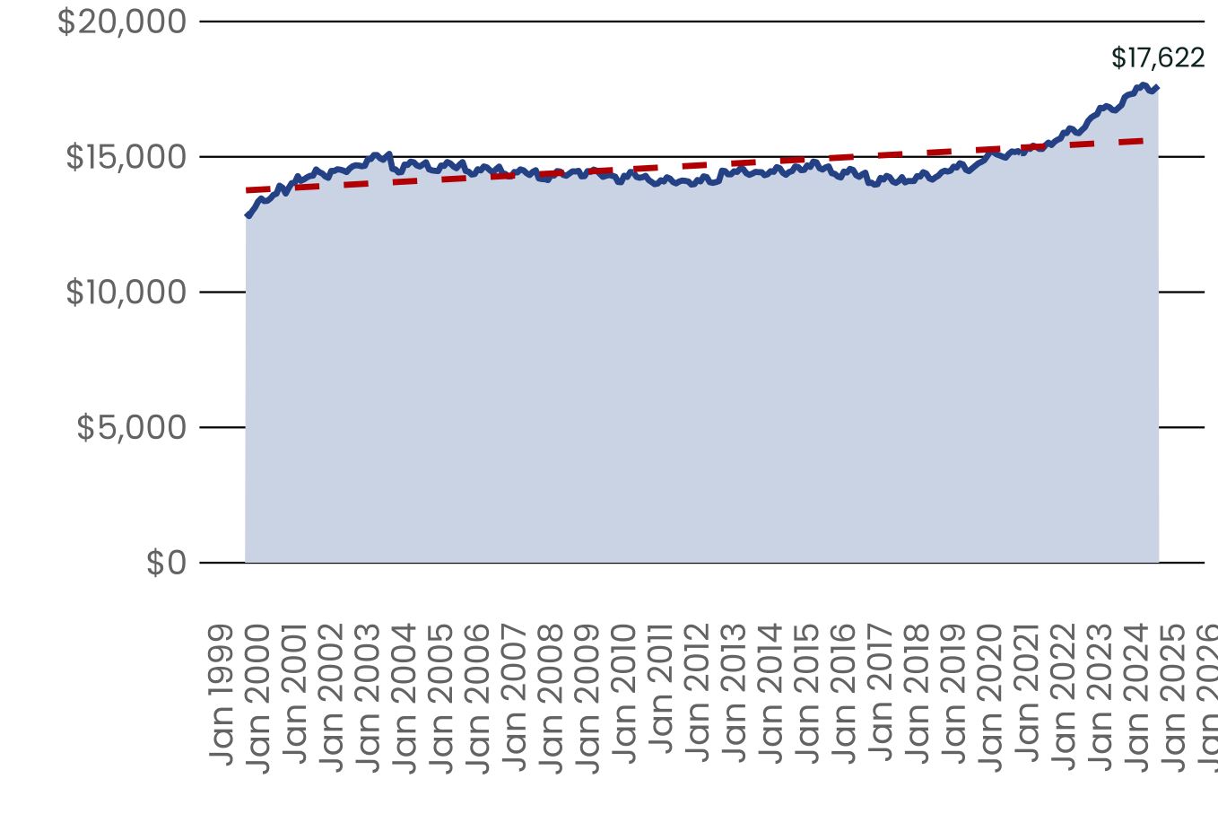
ggplot(datos, aes(x = fecha, y = total_def)) +
geom_area(fill = color_area, alpha = 1) +
geom_line(color = color_linea, linewidth = 1.2) +
geom_line(aes(y = tendencia), color = color_tendencia, linewidth = 1.2, linetype = "dashed") +
geom_text(
data = tail(datos, 1),
aes(label = scales::dollar(total_def)),
hjust = 0.5, vjust = -1,
family = "Poppins", size = 4, color = "#10302C"
) +
scale_x_date(date_labels = "%b %Y",
date_breaks = "1 year")+
scale_y_continuous(labels = dollar_format(), expand = expansion(mult = c(0.1, 0.15))) +
labs(
x = NULL,
y = NULL
) +
tema_python_atdt()
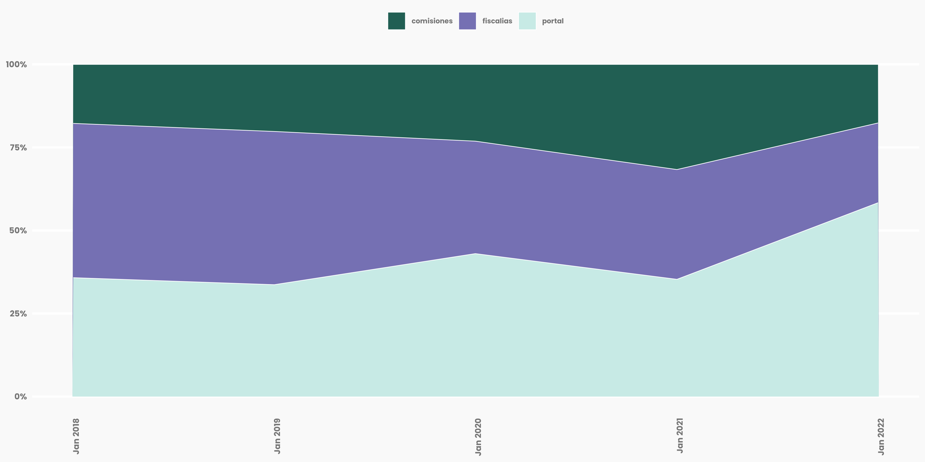
# Colores arbitrarios sin nombres
colores <- c("#215F53", "#7570B3", "#C7EAE5")

# Gráfico
ggplot(df, aes(x = fecha, y = valor, fill = fuente)) +
  geom_area(position = "stack", color = "white", linewidth = 0.4) +
  scale_fill_manual(values = colores) +
  scale_y_continuous(labels = percent_format()) +
  theme_minimal() +
  theme(
    legend.position = "top",
    legend.title = element_blank()
  )

# Paleta fija para las categorías
colores <- c(
  "Hombre" = "#4C6A67",
  "Mujer" = "#627B78",
  "No identificado" = "#6F8583"
)
blanco <- "white"

# Tema ATDT
tema_python_atdt <- function() {
  theme_minimal() +
    theme(
      plot.title = element_text(size = 14, face = "bold", color = "black"),
      axis.text = element_text(size = 10, color = "#767676"),
      axis.title = element_text(size = 10, face = "bold", color = "#000000"),
      axis.text.x = element_text(angle = 90, hjust = 1),
      panel.grid.major.x = element_blank(),
      panel.grid.minor = element_blank(),
      panel.grid.major.y = element_line(color = "#000000", linewidth = 0.4),
      axis.ticks = element_blank(),
      legend.position = "top",
      plot.background = element_rect(fill = "transparent", color = NA),
      panel.background = element_rect(fill = "transparent", color = NA)
    )
}

# Gráfica
ggplot(datos, aes(x = fecha, y = valor, fill = categoria)) +
  geom_col(position = "stack", width = 20) +
  scale_fill_manual(values = colores) +
  scale_x_date(
    date_labels = "%b %Y",
    date_breaks = "1 month",
    expand = expansion(mult = c(0.01, 0.01))
  ) +
  scale_y_continuous(
    expand = expansion(mult = c(0, 0.1))
  ) +
  labs(x = "", y = "") +
  tema_python_atdt()

# Paleta fija para las categorías
colores <- c(
  "Hombre" = "#4C6A67",
  "Mujer" = "#627B78",
  "No identificado" = "#6F8583"
)
blanco <- "white"

# Tema ATDT
tema_python_atdt <- function() {
  theme_minimal() +
    theme(
      plot.title = element_text(size = 14, face = "bold", color = "black"),
      axis.text = element_text(size = 10, color = "#767676"),
      axis.title = element_text(size = 10, face = "bold", color = "#000000"),
      axis.text.x = element_text(angle = 90, hjust = 1),
      panel.grid.major.x = element_blank(),
      panel.grid.minor = element_blank(),
      panel.grid.major.y = element_line(color = "#000000", linewidth = 0.4),
      axis.ticks = element_blank(),
      legend.position = "top",
      plot.background = element_rect(fill = "transparent", color = NA),
      panel.background = element_rect(fill = "transparent", color = NA)
    )
}

# Simular datos apilables
set.seed(123)
fechas <- seq(as.Date("2023-01-01"), as.Date("2023-12-01"), by = "month")
categorias <- c("Hombre", "Mujer", "No identificado")

datos <- expand.grid(fecha = fechas, categoria = categorias) %>%
  mutate(valor = round(runif(n(), 2000, 5000)))

# Gráfica
ggplot(datos, aes(x = fecha, y = valor, fill = categoria)) +
  geom_col(position = "stack", width = 20) +
  scale_fill_manual(values = colores) +
  scale_x_date(
    date_labels = "%b %Y",
    date_breaks = "1 month",
    expand = expansion(mult = c(0.01, 0.01))
  ) +
  scale_y_continuous(
    expand = expansion(mult = c(0, 0.1))
  ) +
  labs(x = "", y = "") +
  tema_python_atdt() +  # primero tu tema base
  theme(                # luego ajustes adicionales
    axis.text.x = element_blank(),
    panel.grid.major.y = element_blank(),
    panel.grid.minor.y = element_blank()
  ) +
  coord_flip()

# Paleta de color
verde_base <- "#10302C"
rojo_maximo <- "#8B0000"
blanco <- "white"

#fonts
font_add("Poppins", "/Users/tabatagarcia/Desktop/plantillas/python/agrupadasyapiladas/fonts/poppins/Poppins-Regular.ttf")
showtext_auto()

tema_python_atdt <- function() {
  theme_minimal(base_family = "Poppins") +
    theme(
      plot.title = element_text(size = 14, face = "bold", color = "black"),
      axis.text = element_text(size = 10, color = "#767676"),
      axis.title = element_text(size = 10, face = "bold", color = "#000000"),
      axis.text.x = element_text(angle = 90, hjust = 1),
      panel.grid.major.x = element_blank(),
      panel.grid.minor = element_blank(),
      panel.grid.major.y = element_line(color = "#000000", linewidth = 0.4, linetype = "solid"),
      axis.ticks = element_blank(),
      legend.position = "none",
      plot.background = element_rect(fill = "transparent", color = NA),
      panel.background = element_rect(fill = "transparent", color = NA)
    )
}

grafica <- ggplot(datos, aes(x = fecha, y = total_def)) +
  geom_col(aes(fill = color_barra), width = 20, show.legend = FALSE) +
  geom_label(aes(y = y_label, label = etiqueta, fill = color_badge),
             color = blanco,
             family = "Poppins",
             size = 3.5,
             label.size = 0,
             angle = 90,
             label.r = unit(6, "pt"),
             hjust = 1,
             vjust = 0.45,
             show.legend = FALSE) +
  scale_fill_identity() +
  scale_x_date(
    date_labels = "%b %Y",
    date_breaks = "1 month",
    expand = expansion(mult = c(0.01, 0.01))
  ) +
  scale_y_continuous(
    labels = scales::dollar_format(),
    expand = expansion(mult = c(0, 0.2))
  ) +
  tema_python_atdt() +
  theme(axis.title.x = element_blank(), axis.title.y = element_blank())

# Paleta de color
verde_base <- "#10302C"
rojo_maximo <- "#8B0000"
blanco <- "white"

#fonts
font_add("Poppins", "/Users/tabatagarcia/Desktop/plantillas/python/agrupadasyapiladas/fonts/poppins/Poppins-Regular.ttf")
showtext_auto()

tema_python_atdt <- function() {
  theme_minimal(base_family = "Poppins") +
    theme(
      plot.title = element_text(size = 14, face = "bold", color = "black"),
      axis.text = element_text(size = 10, color = "#767676"),
      axis.title = element_text(size = 10, face = "bold", color = "#000000"),
      axis.text.x = element_text(angle = 90, hjust = 1),
      panel.grid.major.x = element_blank(),
      panel.grid.minor = element_blank(),
      panel.grid.major.y = element_line(color = "#000000", linewidth = 0.4, linetite = "solid"),
      axis.ticks = element_blank(),
      legend.position = "none",
      plot.background = element_rect(fill = "transparent", color = NA),
      panel.background = element_rect(fill = "transparent", color = NA)
    )
}

grafica <- ggplot(datos, aes(x = fecha, y = total_def)) +
  geom_col(aes(fill = color_barra), width = 20, show.legend = FALSE) +
  geom_label(aes(y = y_label, label = etiqueta, fill = color_badge),
             color = blanco,
             family = "Poppins",
             size = 3.5,
             label.size = 0,
             angle = 0,
             label.r = unit(6, "pt"),
             hjust = 1,
             vjust = 0.45,
             show.legend = FALSE) +
  scale_fill_identity() +
  scale_x_date(
    date_labels = "%b %Y",
    date_breaks = "1 month",
    expand = expansion(mult = c(0.01, 0.01))
  ) +
  scale_y_continuous(
    labels = scales::dollar_format(),
    expand = expansion(mult = c(0, 0.2))
  ) +
  tema_python_atdt() +
  theme(axis.title.x = element_blank(), axis.title.y = element_blank(),
        axis.text.x = element_blank(),
        panel.grid.major.y = element_blank()) +
  coord_flip()

# Tema personalizado
theme_personalizado <- theme_minimal(base_size = 12) +
  theme(
    plot.title = element_text(face = "bold"),
    axis.text.x = element_text(angle = 90, hjust = 1, size = 6),
    axis.text.y = element_text(size = 6),
    axis.title = element_text(size = 10),
    panel.border = element_rect(color = "gray20", fill = NA, linewidth = 0.5),
    axis.ticks = element_blank(),
    panel.grid = element_blank(),
    legend.position = "right"
  )

# Crear gráfica
grafica <- ggplot(datos_sum, aes(x = mes, y = valor, fill = indicador)) +
  geom_col(position = "stack", width = 30) +
  scale_fill_manual(values = c("Con datos" = "#584290", "Sin datos" = "#b1adcf")) +
  labs(
    title = "Ejemplo de gráfica de barras apiladas",
    x = "Fecha",
    y = "Número de casos",
    fill = NULL
  ) +
  scale_x_date(date_breaks = "2 years", date_labels = "%Y") +
  theme_personalizado
# Colores estilo limpio
verde_base <- "#10302C"
rojo_maximo <- "#8B0000"
blanco <- "white"
azul_linea <- "#2F5597"
naranja_linea <- "#D55E00"
# Tema visual tipo matplotlib limpio
tema_estilo_multilinea <- function() {
theme_minimal(base_family = "Poppins") +
theme(
plot.title = element_text(size = 14, face = "bold", color = "black"),
axis.text = element_text(size = 10, color = "#4D4D4D"),
axis.title = element_blank(),
axis.text.x = element_text(angle = 90, hjust = 1),
panel.grid.major = element_line(color = "#E5E5E5", linewidth = 0.3),
panel.grid.minor = element_blank(),
panel.background = element_rect(fill = "white", color = NA),
plot.background = element_rect(fill = "white", color = NA),
legend.position = "top",
legend.title = element_blank(),
legend.text = element_text(size = 10),
axis.ticks = element_blank()
)
}
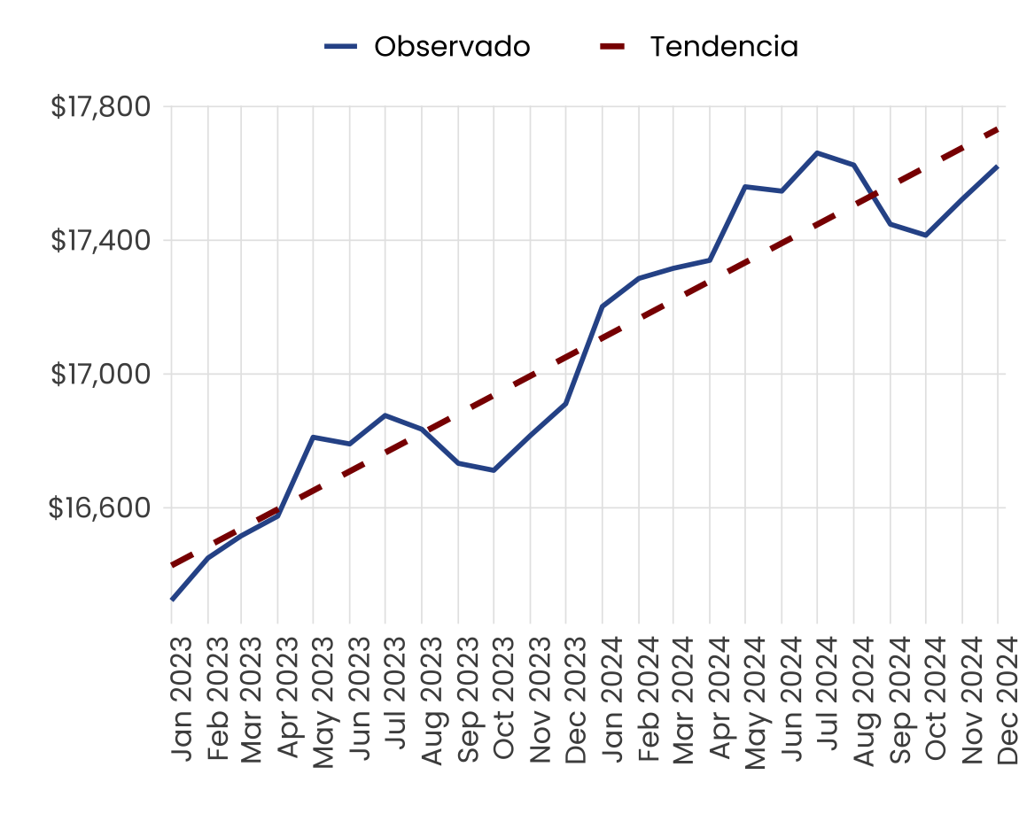
# Gráfica
grafica <- ggplot(datos, aes(x = fecha)) +
geom_line(aes(y = total_def, color = "Observado"), linewidth = 1) +
geom_line(aes(y = tendencia, color = "Tendencia"), linewidth = 1.2, linetype = "dashed") +
geom_hline(yintercept = 0, color = "gray30", linewidth = 0.4) +
scale_color_manual(values = c("Observado" = azul_linea, "Tendencia" = rojo_maximo)) +
scale_x_date(date_labels = "%b %Y", date_breaks = "1 month", expand = expansion(mult = c(0.01, 0.01))) +
scale_y_continuous(labels = dollar_format()) +
tema_estilo_multilinea()
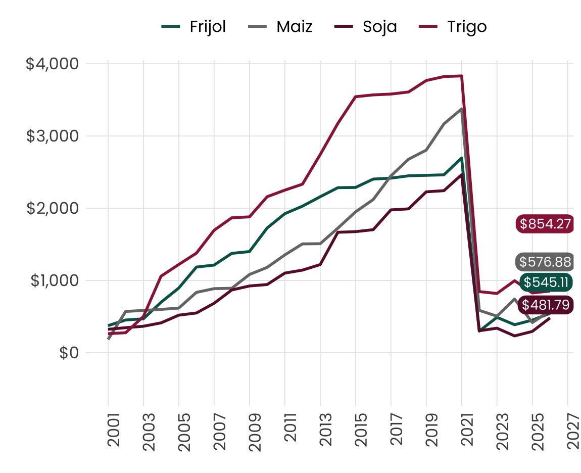
# Colores y tema
colores <- c("#006157", "#767676", "#671435", "#9B2247")
blanco <- "white"

# Últimos puntos para badge
etiquetas <- df_largo %>%
  group_by(variable) %>%
  filter(Fecha == max(Fecha)) %>%
  mutate(etiqueta = scales::dollar(valor))

# Crear badges bien distribuidos verticalmente
etiquetas <- df_largo %>%
  group_by(variable) %>%
  filter(Fecha == max(Fecha)) %>%
  ungroup() %>%
  arrange(desc(valor)) %>%  # ordenar globalmente por valor
  mutate(
    etiqueta = scales::dollar(valor),
    x_label = Fecha + lubridate::days(30),         # desplazar a la derecha
    y_label = valor + row_number() * -250           # separar verticalmente
  )

# Gráfica
ggplot(df_largo, aes(x = Fecha, y = valor, color = variable)) +
  geom_line(linewidth = 1) +
  geom_hline(yintercept = 0, color = "gray30", linewidth = 0.4) +
  scale_color_manual(values = colores) +
  geom_label(data = etiquetas,
             aes(x = x_label, y = y_label, label = etiqueta, fill = variable),
             color = blanco,
             family = "Poppins",
             size = 3.5,
             label.size = 0,
             label.r = unit(6, "pt"),
             hjust = 0.6,
             vjust = -4,
             show.legend = FALSE) +
  scale_fill_manual(values = colores) +
  scale_y_continuous(labels = scales::dollar_format()) +
  scale_x_date(date_labels = "%Y", date_breaks = "2 year") +
  tema_estilo_multilinea() +
  theme(axis.title.x = element_blank(), axis.title.y = element_blank())
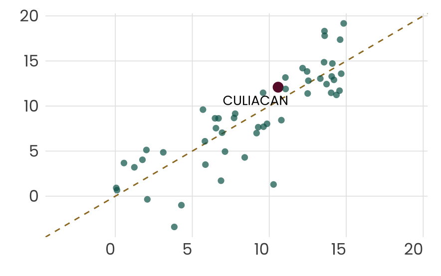
# Clasificación solo para Culiacán
sim_mun <- sim_mun %>%
  mutate(
    is_culiacan = cve_municipio == "CULIACAN",
    color_cat = ifelse(is_culiacan, "Culiacán", "Normal"),
    alpha_cat = ifelse(is_culiacan, 1, 0.7),
    size_cat = ifelse(is_culiacan, 3.5, 2)
  )

# Límites
lim_min <- min(sim_mun$promedio_diario_2023_2024, sim_mun$promedio_diario_2024_2025)
lim_max <- max(sim_mun$promedio_diario_2023_2024, sim_mun$promedio_diario_2024_2025)

# Colores
colores <- c(
  "Culiacán" = "#671435",
  "Normal"   = "#006157"
)

# Gráfica
graf5 <- ggplot(sim_mun, aes(x = promedio_diario_2023_2024, y = promedio_diario_2024_2025)) +
  geom_abline(slope = 1, intercept = 0, color = "#9D792A", linetype = "dashed") +
  geom_point(aes(color = color_cat, alpha = alpha_cat, size = size_cat), shape = 16) +
  geom_vline(xintercept = 0, color = "gray30", linewidth = 0.4) +
  geom_hline(yintercept = 0, color = "gray30", linewidth = 0.4) +
  geom_text_repel(
    data = sim_mun %>% filter(is_culiacan),  # Solo etiqueta a Culiacán
    aes(label = cve_municipio),
    family = "Poppins", fontface = "bold", size = 3.5,
    box.padding = 0.4, max.overlaps = 10
  ) +
  scale_color_manual(values = colores) +
  scale_alpha_identity() +
  scale_size_identity() +
  scale_x_continuous(limits = c(lim_min, lim_max), labels = comma_format()) +
  scale_y_continuous(limits = c(lim_min, lim_max), labels = comma_format()) +
  tema_estilo_multilinea() +
  theme(
    legend.position = "none",
    plot.margin = margin(10, 10, 10, 10),
      axis.text.x = element_text(angle = 0, vjust = 1, hjust = 1)
  )
# Fuente y estilo
font_add("Poppins", "/Users/tabatagarcia/Desktop/plantillas/python/agrupadasyapiladas/fonts/poppins/Poppins-Regular.ttf")
showtext_auto()
# Tema limpio tipo matplotlib
tema_python_atdt_2 <- function() {
theme_minimal(base_family = "Poppins") +
theme(
plot.title = element_text(size = 20, face = "bold", color = "black"),
axis.text = element_text(size = 14, color = "#767676"),
axis.title = element_blank(),
panel.grid.major.x = element_blank(),
panel.grid.minor = element_blank(),
panel.grid.major.y = element_line(color = "#000000", linewidth = 0.4),
axis.ticks = element_blank(),
plot.background = element_rect(fill = "transparent", color = NA),
panel.background = element_rect(fill = "transparent", color = NA)
)
}
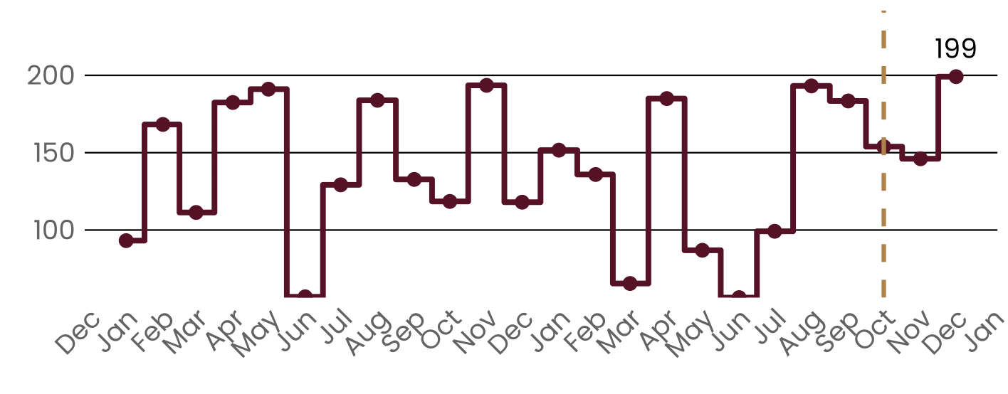
ggplot(df, aes(x = Fecha, y = y)) +
geom_step(color = "#691c32", linewidth = 1.4, direction = "mid") +
geom_point(color = "#691c32", size = 3) +
geom_vline(xintercept = 0, color = "gray30", linewidth = 0.4) + # línea eje Y
geom_hline(yintercept = 0, color = "gray30", linewidth = 0.4) + # línea eje X
geom_vline(xintercept = as.Date("2024-10-01"), color = "#BC955C",
linetype = "dashed", linewidth = 1.1) +
geom_text(
data = ultimo_punto,
aes(label = scales::comma(y)),
vjust = -1,
fontface = "bold",
size = 5,
family = "Poppins"
) +
scale_y_continuous(labels = comma_format(),
expand = expansion(mult = c(0, 0.3))) +
scale_x_date(date_breaks = "1 month", date_labels = "%b") +
tema_python_atdt_2() +
theme(
axis.text.x = element_text(angle = 45, hjust = 1)
)
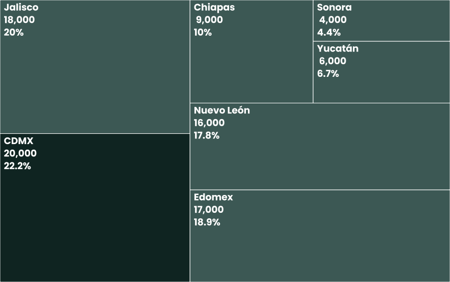
# Fuente
font_add_google("Poppins", "Poppins")
showtext_auto()

# Colores
verde_oscuro <- "#10302C"
verde_claro <- "#4C6A67"
data <- data %>%
  mutate(
    color = ifelse(total == max(total), verde_oscuro, verde_claro)
  )

# Treemap
ggplot(data, aes(area = total, fill = color, label = etiqueta)) +
  geom_treemap(color = "white", linewidth = 3) +
  geom_treemap_text(
    family = "Poppins", fontface = "bold", colour = "white",
    place = "topleft", grow = FALSE, reflow = TRUE,
    lineheight = 1.1, size = 7
  ) +
  scale_fill_identity() +
  theme_void()